Aim
This vignette shows how to validate adjusted origin-destination (OD) flows. In the previous vignette, we used debiasR adjustment methods to move from raw mobile-phone-derived flows, , to adjusted flows, . Here, we check whether those adjusted flows better align with a trusted benchmark, .
The main validation comparison is adjusted versus benchmark flows. This tells us whether an adjustment method makes the digital-trace-derived OD measurements closer to the target OD table.
The same validation tools can also compare:
- raw mobile-phone-derived versus benchmark flows, to describe the starting point before adjustment
- raw versus adjusted flows, to describe how much the adjustment changed the raw data
The validation functions in debiasR assess adjustment outputs at several levels: the whole OD system, origin and destination marginals, individual OD pairs, origin-conditioned destination allocations, and spatial/residual structure. These checks help users understand whether an adjustment improves overall fit, reduces local errors, preserves the structure of movement between places, and leaves fewer systematic residual patterns.
Intuition
A practical way to think of assessing the output of the various adjustment methods is to adopt an overall system-wide perspective of the flow system, move to an intermediate marginal perspective, then to individual origin-destination pairs, then to the allocation of destinations within each origin, and finally to the structure of the remaining residuals. We use five levels.
Level 1 summarises the performance of adjustment methods across the whole OD system.
Level 2 compares origin and destination totals. This checks whether adjusted flows reproduce total outflows from each origin and total inflows to each destination.
Level 3 compares individual OD pairs. This shows where large local errors remain after adjustment.
Level 4 assesses whether each origin allocates its flows across destinations in a similar way to the benchmark, after converting OD flows into destination-share distributions.
Level 5 checks whether adjusted-minus-benchmark residuals still show structure after adjustment, such as dependence on flow size, global or local spatial clustering across neighbouring areas, or association with known area covariates.
Correlation coefficients measure correspondence between two sets of flows, such as adjusted and benchmark flows. They are useful for checking whether large flows in one table tend to be large in the other. Error metrics measure difference in scale. Both are needed: a method can preserve the broad pattern of movement while still producing flows that are too large or too small. Distributional allocation metrics answer a different question: whether the relative allocation of destinations from each origin is preserved, regardless of total scale. Residual-structure diagnostics ask whether the remaining errors look systematic after adjustment.
Validation measures
Let be the adjusted flow from origin to destination , and let be the benchmark flow for the same OD pair. Define the error as . Positive errors mean the adjusted flow is larger than the benchmark. Negative errors mean it is smaller. The table uses adjusted-versus-benchmark notation.1
| Metric | Description | Equation |
|---|---|---|
| Mean error | Average signed error; shows whether flows are overestimated or underestimated on average. | |
| Mean absolute error | Average absolute error; shows the typical size of the error, ignoring sign. | |
| Root mean squared error | Error metric that gives more weight to large errors. | |
| Median absolute error | Middle absolute error; less affected by a small number of very large errors. | |
| Mean absolute percentage error | Average absolute error as a percentage of the benchmark flow. | |
| Pearson’s r | Linear correlation; shows whether large benchmark flows also tend to be large adjusted flows. | |
| Spearman’s rho | Rank correlation; shows whether the ordering of flows is similar. | |
| Kullback-Leibler divergence | Level 4 metric. Directional difference between origin-conditioned destination-share distributions. Lower values mean the comparison flow allocates destinations more like the reference flow. | |
| Jensen-Shannon divergence | Level 4 metric. Symmetric companion to KL divergence for the same origin-conditioned destination-share distributions. Lower values mean closer allocation. | |
| Residual-versus-benchmark-flow correlation | Level 5 diagnostic. Association between remaining residuals and benchmark flow size. Values near zero suggest less obvious scale dependence. | |
| Moran’s I | Level 5 diagnostic. Spatial autocorrelation in area-level residuals using user-supplied neighbour links . Positive values suggest neighbouring areas have similar residuals. | |
| Local Moran’s I and LISA class | Level 5 diagnostic. Local spatial association for each area, with permutation pseudo p-values and cluster classes such as high-high, low-low, high-low and low-high. | |
| Residual-versus-covariate correlation | Level 5 diagnostic. Association between area-level residuals and a selected area covariate . Values near zero suggest less obvious covariate-linked error. |
Getting ready
The README shows how to install debiasR and the companion debiasRdata package from GitHub. We start by loading the packages used in this vignette.
We use the same empirical LAD travel-to-work example introduced in the earlier vignettes. First, we identify the main data objects directly from debiasRdata.
OD_travel2work <- debiasRdata::lad_OD_travel2work
census_OD_travel2work <- debiasRdata::census_lad_OD_travel2work
coverage <- debiasRdata::coverage_lad |>
  dplyr::rename(area = code)
covariates <- debiasRdata::lad_covariates
centroids <- debiasRdata::lad_centroids
head(OD_travel2work) origin destination flow
1 E06000001 E06000001 854
2 E06000001 E06000002 33
3 E06000001 E06000003 14
4 E06000001 E06000004 95
5 E06000001 E06000005 15
6 E06000001 E06000009 1
head(census_OD_travel2work) origin destination flow
1 E06000001 E06000001 14513
2 E06000001 E06000002 1500
3 E06000001 E06000003 671
4 E06000001 E06000004 4240
5 E06000001 E06000005 398
6 E06000001 E06000007 2
head(coverage) date name area population user_count
1 2021 Hartlepool E06000001 92338 1207
2 2021 Middlesbrough E06000002 143926 1028
3 2021 Redcar and Cleveland E06000003 136531 1144
4 2021 Stockton-on-Tees E06000004 196595 1755
5 2021 Darlington E06000005 107799 1165
6 2021 Halton E06000006 128478 1744For the validation examples, we use debiasR::debiasR_example_data() to prepare a small, aligned version of these data. This gives us raw MPD flows, benchmark flows, coverage data, covariates and distances on the same selected set of LADs.
example_data <- debiasR::debiasR_example_data(
  n_areas = 25,
  complete_grid = TRUE
)
We compare two adjustment methods: inverse penetration weighting and selection rate II. First, we organise the raw mobile-phone-derived flows, benchmark flows and coverage table. We then apply the two adjustment methods and join the raw, adjusted and benchmark flows into one data frame for validation.
mpd_od <- example_data$mpd_od
benchmark_od <- example_data$benchmark_od
coverage_validation <- example_data$coverage
covariates_validation <- example_data$covariates

method_results <- list(
  inverse_penetration = debiasR::adjust_inverse_penetration(
    mpd_od_df = mpd_od,
    coverage_df = coverage_validation,
    weight_by = "both"
  ),
  selection_rate2 = debiasR::adjust_selection_rate2(
    mpd_od_df = mpd_od,
    coverage_df = coverage_validation,
    weight_by = "origin",
    benchmark_od_df = benchmark_od,
    calibration_aggregate = "origin"
  )
)

flow_comparison <- validation_build_flow_comparison(
  method_results = method_results,
  mpd_df = mpd_od,
  benchmark_df = benchmark_od
)
Level 1: Overall validation
This level provides a single number summary metric for the whole system of origin-destination flows. Each row in the output table reports a measure for one method and one data-type comparison (e.g. adjusted vs benchmark flows or raw vs adjusted flows).
The main results are the adjusted-versus-benchmark rows. These rows indicate whether the adjusted flows are close to the benchmark flows. The raw-versus-benchmark rows show the starting point before adjustment. The raw-versus-adjusted rows show how much the method adjusted the original data.
overall_metrics <- validation_metrics_by_method(
  data = flow_comparison,
  level = "overall"
)

overall_metrics |>
  dplyr::arrange(comparison, mae) |>
validation_display_metrics()| Method | Comparison | n | Pearson r | Spearman rho | Mean error | MAE | RMSE | Median absolute error | MAPE (%) |
|---|---|---|---|---|---|---|---|---|---|
| Inverse penetration | Adjusted vs benchmark | 625 | 1.000 | 0.778 | -4.79 | 299.91 | 734.12 | 99.73 | 786.09 |
| Selection rate II | Adjusted vs benchmark | 625 | 0.986 | 0.762 | -3560.81 | 3561.10 | 17439.03 | 13.28 | 76.69 |
| Selection rate II | Raw vs adjusted | 625 | 1.000 | 0.997 | -6.02 | 6.02 | 28.68 | 0.19 | 4.67 |
| Inverse penetration | Raw vs adjusted | 625 | 0.986 | 0.993 | 3550.00 | 3550.00 | 16914.23 | 114.92 | 2758.07 |
| Inverse penetration | Raw vs benchmark | 625 | 0.986 | 0.772 | -3554.78 | 3555.12 | 17410.74 | 13.00 | 76.00 |
| Selection rate II | Raw vs benchmark | 625 | 0.986 | 0.772 | -3554.78 | 3555.12 | 17410.74 | 13.00 | 76.00 |
Interpretation
Error metrics. Lower mean absolute error, RMSE and median absolute error mean that the set of flows in the comparison are closer in size. The sign of mean error indicates the direction of this difference, with a positive score indicating overestimation on average, and a negative value indicating underestimation on average.
Correlation coefficients. A high Pearson correlation means the method represents the same broad pattern of large and small flows as the benchmark. A high Spearman correlation indicates that the ranking of flows is similar. A key point here is that the focus of correlation coefficients is to offer an assessment of the overall correspondence or proportionality between two distributions. Hence, a correlation coefficient can be high and still have large errors as correlation may provide a good assessment of the pattern but of the scale of flows.
level1_primary <- overall_metrics |>
  dplyr::filter(comparison == "adjusted_vs_benchmark")

level1_lowest_mae <- level1_primary |>
  dplyr::slice_min(mae, n = 1, with_ties = FALSE) |>
  dplyr::pull(method_label)

level1_highest_r <- level1_primary |>
  dplyr::slice_max(pearson_r, n = 1, with_ties = FALSE) |>
  dplyr::pull(method_label)
Level 2: Marginal validation
Level 2 compares geographical area totals across origins and destinations. It complements the level-1 assessment. The adjusted flows can look reasonable overall while still significantly over- or under-estimating specific origins and destinations. An origin marginal adds together all flows from an individual area. We therefore assess the performance of an adjustment method to produce adjusted flows which are close to the benchmark total outflow. A destination marginal adds together all flows arriving in each area. In this case, we assess the performance of an adjustment method to produce adjusted flows which are close to the benchmark total inflow.
marginal_comparison <- validation_build_margins(flow_comparison)
marginal_metrics <- validation_metrics_by_method_level(marginal_comparison)

marginal_metrics |>
  dplyr::arrange(level, comparison, mae) |>
validation_display_metrics()| Marginal total | Method | Comparison | n | Pearson r | Spearman rho | Mean error | MAE | RMSE | Median absolute error | MAPE (%) |
|---|---|---|---|---|---|---|---|---|---|---|
| destination | Inverse penetration | Adjusted vs benchmark | 25 | 0.998 | 0.992 | -119.66 | 2040.04 | 2553.66 | 1786.85 | 2.83 |
| destination | Selection rate II | Adjusted vs benchmark | 25 | 0.914 | 0.841 | -89020.17 | 89020.17 | 96204.93 | 84625.17 | 96.54 |
| destination | Selection rate II | Raw vs adjusted | 25 | 1.000 | 1.000 | -150.57 | 150.57 | 162.14 | 140.56 | 4.67 |
| destination | Inverse penetration | Raw vs adjusted | 25 | 0.916 | 0.834 | 88749.94 | 88749.94 | 95721.53 | 85971.08 | 2803.31 |
| destination | Inverse penetration | Raw vs benchmark | 25 | 0.915 | 0.841 | -88869.60 | 88869.60 | 96044.74 | 84494.00 | 96.37 |
| destination | Selection rate II | Raw vs benchmark | 25 | 0.915 | 0.841 | -88869.60 | 88869.60 | 96044.74 | 84494.00 | 96.37 |
| origin | Inverse penetration | Adjusted vs benchmark | 25 | 1.000 | 0.995 | -119.66 | 694.61 | 1050.26 | 501.63 | 0.83 |
| origin | Selection rate II | Adjusted vs benchmark | 25 | 0.900 | 0.752 | -89020.17 | 89020.17 | 95584.16 | 84974.09 | 96.56 |
| origin | Selection rate II | Raw vs adjusted | 25 | 1.000 | 1.000 | -150.57 | 150.57 | 161.60 | 147.09 | 4.67 |
| origin | Inverse penetration | Raw vs adjusted | 25 | 0.910 | 0.768 | 88749.94 | 88749.94 | 95294.79 | 84316.20 | 2799.76 |
| origin | Inverse penetration | Raw vs benchmark | 25 | 0.900 | 0.752 | -88869.60 | 88869.60 | 95424.69 | 84852.00 | 96.39 |
| origin | Selection rate II | Raw vs benchmark | 25 | 0.900 | 0.752 | -88869.60 | 88869.60 | 95424.69 | 84852.00 | 96.39 |
We can use scatterplots to explore the data underpinning the results. We plotted the three sets of comparisons described at the start of this vignette: adjusted vs benchmark, raw vs benchmark, and raw vs adjusted flows. Each point represents an area total of inflows or outflows. Points near the dashed line have similar flow values. Points above the line are larger in the flow dataset on the vertical axis. Points below the line are smaller in that same dataset.
validation_plot_margin_scatter(
  marginal_comparison,
  level = "destination_marginal"
)
validation_plot_margin_scatter(
  marginal_comparison,
  level = "origin_marginal"
)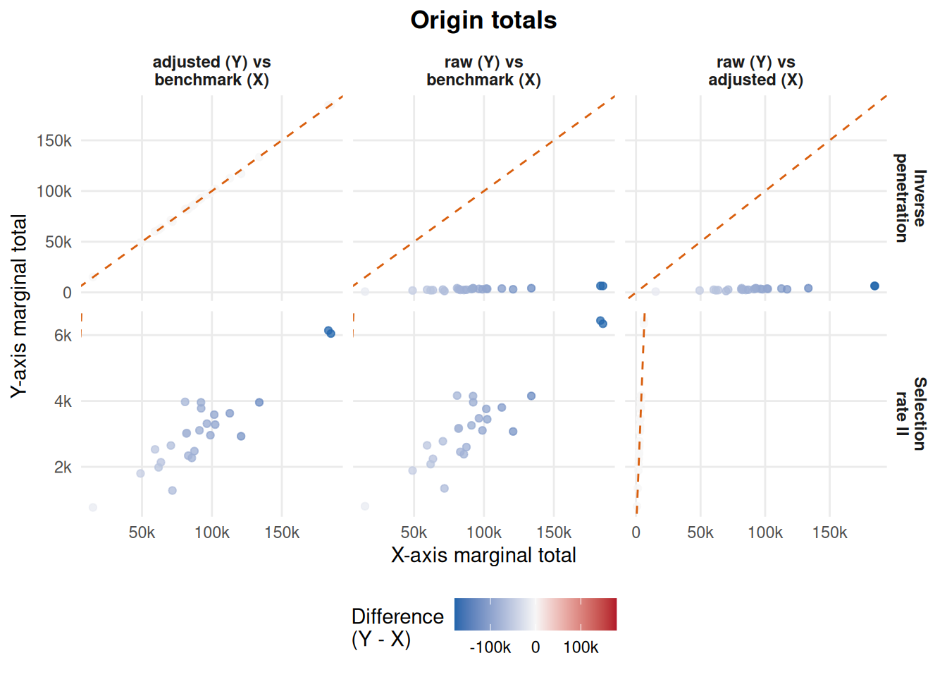
We can also use the resulting assessment metrics to identify the largest (remaining) marginal errors post adjustment. It helps determine if the remaining error is concentrated in a small number of areas.
area_names <- covariates_validation |>
  dplyr::select(area, name)

marginal_patterns <- marginal_comparison |>
  dplyr::left_join(area_names, by = "area") |>
  dplyr::mutate(
    raw_residual = flow_mpd - flow_bench,
    adjusted_residual = flow_adj - flow_bench,
    abs_adjusted_residual = abs(adjusted_residual),
    abs_error_reduction = abs(raw_residual) - abs(adjusted_residual)
  )

marginal_patterns |>
  dplyr::group_by(method_label, level) |>
  dplyr::slice_max(order_by = abs_adjusted_residual, n = 3, with_ties = FALSE) |>
  dplyr::ungroup() |>
  dplyr::arrange(method_label, level, dplyr::desc(abs_adjusted_residual)) |>
  dplyr::select(
    method = method_label,
    level,
    name,
    flow_adj,
    flow_bench,
    adjusted_residual,
    abs_error_reduction
  )
# A tibble: 12 × 7
method level name flow_adj flow_bench adjusted_residual abs_error_reduction
<chr> <chr> <chr> <dbl> <dbl> <dbl> <dbl>
1 Invers… dest… West… 104426. 110723 -6297. 100567.
2 Invers… dest… Brad… 110925. 116342 -5417. 108032.
3 Invers… dest… West… 22123. 18220 3903. 13192.
4 Invers… orig… Brad… 117010. 120849 -3839. 113936.
5 Invers… orig… Leic… 69753. 71738 -1985. 68408.
6 Invers… orig… Leeds 184716. 183278 1438. 175398.
7 Select… dest… Leeds 6540. 199961 -193421. -321.
8 Select… dest… Birm… 6106. 184326 -178220. -299.
9 Select… dest… Corn… 4025. 133631 -129606. -198.
10 Select… orig… Birm… 6047. 185078 -179031. -297.
11 Select… orig… Leeds 6141. 183278 -177137. -301.
12 Select… orig… Corn… 3958. 133867 -129909. -195.
level2_best <- marginal_metrics |>
  dplyr::filter(comparison == "adjusted_vs_benchmark") |>
  dplyr::group_by(level) |>
  dplyr::slice_min(mae, n = 1, with_ties = FALSE) |>
  dplyr::ungroup()

level2_origin_best <- level2_best |>
  dplyr::filter(level == "origin_marginal") |>
  dplyr::pull(method_label)

level2_destination_best <- level2_best |>
  dplyr::filter(level == "destination_marginal") |>
  dplyr::pull(method_label)
In this example, Inverse penetration is closer to benchmark origin totals by mean absolute error, while Inverse penetration is closer to benchmark destination totals. We therefore have clear evidence as the same method is closer at both margins. If the two margins favoured different methods, the choice would depend on whether origin outflows or destination inflows matter more for the analysis.
Level 3: Origin-destination pair validation
Level 3 focuses on comparing individual origin-destination pairs. It zooms in to provide more granular detail and identify specific origin-destination interactions where large local errors are brought to light.
flow_level_metrics <- validation_metrics_by_method(
  data = flow_comparison,
  level = "individual_flow"
)

flow_level_metrics |>
  dplyr::arrange(comparison, mae) |>
validation_display_metrics()| Method | Comparison | n | Pearson r | Spearman rho | Mean error | MAE | RMSE | Median absolute error | MAPE (%) |
|---|---|---|---|---|---|---|---|---|---|
| Inverse penetration | Adjusted vs benchmark | 625 | 1.000 | 0.778 | -4.79 | 299.91 | 734.12 | 99.73 | 786.09 |
| Selection rate II | Adjusted vs benchmark | 625 | 0.986 | 0.762 | -3560.81 | 3561.10 | 17439.03 | 13.28 | 76.69 |
| Selection rate II | Raw vs adjusted | 625 | 1.000 | 0.997 | -6.02 | 6.02 | 28.68 | 0.19 | 4.67 |
| Inverse penetration | Raw vs adjusted | 625 | 0.986 | 0.993 | 3550.00 | 3550.00 | 16914.23 | 114.92 | 2758.07 |
| Inverse penetration | Raw vs benchmark | 625 | 0.986 | 0.772 | -3554.78 | 3555.12 | 17410.74 | 13.00 | 76.00 |
| Selection rate II | Raw vs benchmark | 625 | 0.986 | 0.772 | -3554.78 | 3555.12 | 17410.74 | 13.00 | 76.00 |
Scatterplots
We produce a similar scatterplot as we did for marginal totals. Here each point is a single origin-destination pair. Points close to the dashed line are more similar. Points far from the line are more dissimilar reflecting differences from the reference origin-destination pair.
validation_plot_od_scatter(flow_comparison)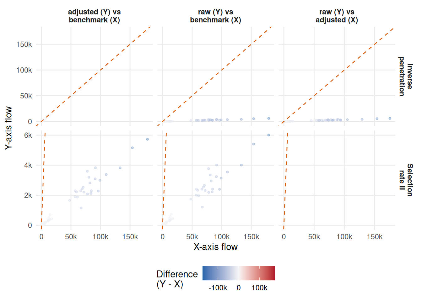
Largest residuals and heatmap
We can also rank individual origin-destination pairs by the largest remaining adjusted-minus-benchmark residuals. Positive values mean the adjusted estimate is larger than the benchmark. Negative values mean it is smaller.
validation_rank_largest_residuals(flow_comparison, n = 12)# A tibble: 12 × 10
method origin destination flow_mpd flow_adj flow_bench adjustment
<chr> <chr> <chr> <dbl> <dbl> <dbl> <dbl>
1 Selection rate II E08000… E08000025 6007 5726. 179556 -281.
2 Selection rate II E08000… E08000035 5412 5159. 153992 -253.
3 Selection rate II E06000… E06000052 4009 3821. 133220 -188.
4 Selection rate II E08000… E08000019 3543 3377. 109648 -166.
5 Selection rate II E06000… E06000054 3140 2993. 99027 -147.
6 Selection rate II E08000… E08000032 2393 2280. 96301 -113.
7 Selection rate II E06000… E06000062 3240 3089. 90978 -151.
8 Selection rate II E06000… E06000047 4015 3829. 91482 -186.
9 Selection rate II E08000… E08000012 2409 2296. 84546 -113.
10 Selection rate II E06000… E06000023 2227 2122. 83959 -105.
11 Selection rate II E06000… E06000061 2952 2814. 82184 -138.
12 Selection rate II E06000… E06000058 3348 3193. 80467 -155.
# ℹ 3 more variables: adjusted_residual <dbl>, abs_error_reduction <dbl>,
# movement <chr>More usefully, we can create a compact heatmap to understand and summarise the full set of origin-destination pair residuals by standard deviation (SD) bands. The residual for each adjustment method is the adjusted-minus-benchmark difference, . The SD bands are defined from the pooled adjusted-minus-benchmark residuals across the two adjustment methods, so a band means the same thing in each column.
Each cell is the percentage of origin-destination pairs in that residual band. For example, a value of 0.16 means that 0.16% of origin-destination pairs in that column fall in the residual-size band named on the row. Lower percentages in the high-SD rows indicate fewer large outliers.
residual_heatmap <- validation_build_residual_heatmap(flow_comparison)
validation_plot_residual_heatmap(residual_heatmap)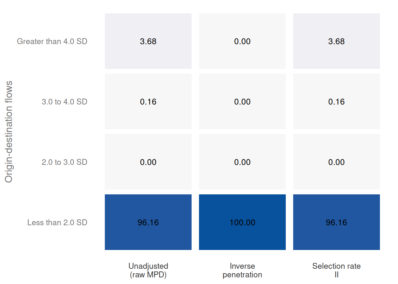
The heatmap also includes the unadjusted raw MPD as a baseline. This baseline uses the raw-minus-benchmark difference, , and is classified using the same adjusted-residual SD bands. The heatmap offers a way to enable visual comparison. If an adjustment reduces the share of flows above 2, 3 or 4 standard deviations, it contributes to reducing the number of large origin-destination-pair errors.
level3_best <- flow_level_metrics |>
  dplyr::filter(comparison == "adjusted_vs_benchmark") |>
  dplyr::slice_min(mae, n = 1, with_ties = FALSE) |>
  dplyr::pull(method_label)

large_outlier_summary <- residual_heatmap |>
  dplyr::filter(residual_band %in% c("Greater than 4.0 SD", "3.0 to 4.0 SD")) |>
  dplyr::group_by(method_label) |>
  dplyr::summarise(large_outlier_share = sum(share), .groups = "drop") |>
  dplyr::filter(method_label != "Unadjusted") |>
  dplyr::slice_min(large_outlier_share, n = 1, with_ties = FALSE)

level3_outlier_best <- large_outlier_summary |>
  dplyr::pull(method_label)
At the individual origin-destination pair level, Inverse penetration has the lower mean absolute error against the benchmark in this example. Looking only at the largest residual bands, Inverse penetration has the smaller share of OD pairs above three standard deviations.
Level 4: Distributional allocation validation
The previous levels compare scale, residuals and outliers. Level 4 asks a different question: whether each origin sends its flows to destinations in similar proportions across the raw, adjusted and benchmark OD matrices. This is not primarily an individual OD-flow magnitude check. It is an origin-conditioned allocation check, because it evaluates the destination-share distribution within each origin. This is useful because a method can improve total flow scale while still allocating an origin’s flows to the wrong destinations.
debiasR::validate_flow_distribution() computes origin-conditioned destination-share metrics. For each origin, the function converts flows to destination shares and then reports KL divergence and Jensen-Shannon divergence. The table below asks for all three comparisons: raw versus benchmark, adjusted versus benchmark, and raw versus adjusted.
distribution_summaries <- lapply(
  names(method_results),
  function(method_id) {
    debiasR::validate_flow_distribution(
      adj_df = method_results[[method_id]],
      benchmark_od_df = benchmark_od,
      comparisons = "all",
      method_name = method_id,
      weight_by = "benchmark_origin_total",
      return_origin_level = FALSE
    )$summary
  }
) |>
  dplyr::bind_rows() |>
  dplyr::mutate(
    method_label = dplyr::coalesce(
      unname(validation_method_labels[method]),
      method
    ),
    comparison_label = dplyr::coalesce(
      unname(validation_comparison_labels[comparison]),
      comparison
    )
  )

distribution_summaries |>
  dplyr::transmute(
    Method = method_label,
    Comparison = comparison_label,
    `Origins used` = n_origins_used,
    `Mean KL` = round(kl_mean, 4),
    `Weighted mean KL` = round(kl_weighted_mean, 4),
    `Mean JSD` = round(jsd_mean, 4),
    `Weighted mean JSD` = round(jsd_weighted_mean, 4)
  ) |>
knitr::kable()| Method | Comparison | Origins used | Mean KL | Weighted mean KL | Mean JSD | Weighted mean JSD |
|---|---|---|---|---|---|---|
| Inverse penetration | Adjusted vs benchmark | 25 | 0.0343 | 0.0300 | 0.0089 | 0.0080 |
| Inverse penetration | Raw vs adjusted | 25 | 0.0009 | 0.0008 | 0.0002 | 0.0002 |
| Inverse penetration | Raw vs benchmark | 25 | 0.0328 | 0.0298 | 0.0088 | 0.0082 |
| Selection rate II | Adjusted vs benchmark | 25 | 0.0328 | 0.0298 | 0.0088 | 0.0082 |
| Selection rate II | Raw vs adjusted | 25 | 0.0000 | 0.0000 | 0.0000 | 0.0000 |
| Selection rate II | Raw vs benchmark | 25 | 0.0328 | 0.0298 | 0.0088 | 0.0082 |
Here, the benchmark-weighted means give more influence to origins with larger benchmark outflows. KL divergence is directional, so the reference distribution matters. Jensen-Shannon divergence is symmetric and easier to compare across rows. Both metrics evaluate allocation shares, not whether the total number of flows is correct.
Level 5: Spatial/residual structure diagnostics
The previous levels can show that an adjustment improves average error, area totals, individual OD pairs and destination-share allocation. Level 5 asks whether the remaining residuals still look systematic. After adjustment, large residuals should not be strongly concentrated in large benchmark flows, clustered across neighbouring areas globally or locally, or linked to known area characteristics. These checks do not prove that residuals are random, but they help identify patterns that may need further model development or local review.
validate_flow_residual_structure() uses the adjusted-minus-benchmark residual by default. It also needs a choice about whether area-level residuals should be summarised by origin or by destination. The example below uses origin areas and mean residuals. For the optional Moran’s I diagnostic, users supply a plain neighbour-link table. The optional Local Moran’s I diagnostics use the same neighbour links to flag local indicators of spatial association (LISA), such as high-residual areas near high-residual neighbours or low-residual areas near low-residual neighbours. Here, a hidden setup chunk creates a simple illustrative ring-neighbour table from the example LADs. In applied work, this should be replaced by real contiguity or distance-based neighbour links.
residual_structure <- stats::setNames(
  lapply(
    names(method_results),
    function(method_id) {
      debiasR::validate_flow_residual_structure(
        adj_df = method_results[[method_id]],
        benchmark_od_df = benchmark_od,
        method_name = method_id,
        residual_type = "adjusted",
        spatial_role = "origin",
        residual_aggregation = "mean",
        area_neighbors = structure_neighbors,
        local_moran = TRUE,
        local_moran_nsim = 199,
        local_moran_seed = 20260613,
        covariate_df = structure_covariates,
        covariate_col = "per_level4"
      )
    }
  ),
  names(method_results)
)

validation_display_residual_structure(residual_structure)| Method | Residual type | Spatial role | Aggregation | OD pairs | Areas | Residual vs benchmark-flow r | Moran's I | Residual vs covariate r |
|---|---|---|---|---|---|---|---|---|
| Inverse penetration | adjusted | origin | mean | 625 | 25 | -0.701 | -0.024 | 0.246 |
| Selection rate II | adjusted | origin | mean | 625 | 25 | -1.000 | 0.126 | 0.388 |
The residual-versus-benchmark-flow correlation checks whether remaining errors are larger or smaller for large benchmark flows. Moran’s I checks whether origin-level residuals are similar across the supplied neighbour links. The residual-versus-covariate correlation checks whether origin-level residuals are associated with the selected area characteristic. In this example, the covariate is the percentage of residents with Level 4 qualifications or above (per_level4). Values close to zero are usually preferable because they suggest less obvious residual structure.
Local Moran’s I provides a local version of the spatial clustering check. The LISA class labels combine the sign of an area’s centred residual with the weighted residual pattern in its neighbours. The p-values in this table are permutation pseudo p-values from the supplied neighbour links, so they are best used as exploratory flags for local review rather than as definitive map clusters.
validation_display_local_moran(
  residual_structure,
  area_names = area_names,
  n = 8
)| Method | Area | Mean residual | Local Moran's I | Pseudo p | Adjusted p | Quadrant | Cluster |
|---|---|---|---|---|---|---|---|
| Selection rate II | Coventry | -2455.23 | -2.712 | 0.020 | 0.250 | high-low | not significant |
| Selection rate II | Cardiff | -2394.93 | 2.575 | 0.030 | 0.250 | high-high | not significant |
| Inverse penetration | Leicester | -79.39 | -2.364 | 0.205 | 0.732 | low-high | not significant |
| Inverse penetration | Bradford | -153.57 | 1.876 | 0.605 | 0.839 | low-low | not significant |
| Selection rate II | Westminster | -566.87 | 1.865 | 0.390 | 0.979 | high-high | not significant |
| Inverse penetration | East Riding of Yorkshire | 33.75 | -1.614 | 0.165 | 0.708 | high-low | not significant |
| Inverse penetration | Kirklees | -35.28 | 1.514 | 0.105 | 0.708 | low-low | not significant |
| Selection rate II | Sheffield | -4365.92 | 1.428 | 0.105 | 0.656 | low-low | not significant |
We can also inspect the origins with the largest remaining mean residuals. The table below ranks origins by the absolute value of the selected mean residual. Positive residuals mean the adjusted outflows are larger than the benchmark outflows on average; negative residuals mean they are smaller.
validation_display_residual_structure_areas(
  residual_structure,
  area_names = area_names,
  n = 5
)| Method | Area | Mean residual | Mean absolute residual | Benchmark total | Raw MPD total | Adjusted total |
|---|---|---|---|---|---|---|
| Inverse penetration | Bradford | -153.57 | 153.57 | 120849 | 3074 | 117010 |
| Inverse penetration | Leicester | -79.39 | 79.39 | 71738 | 1345 | 69753 |
| Inverse penetration | Leeds | 57.52 | 57.52 | 183278 | 6442 | 184716 |
| Inverse penetration | Buckinghamshire | 41.48 | 41.48 | 80801 | 4164 | 81838 |
| Inverse penetration | Bournemouth, Christchurch and Poole | 35.85 | 35.85 | 92308 | 3961 | 93204 |
| Selection rate II | Birmingham | -7161.22 | 7161.22 | 185078 | 6344 | 6047 |
| Selection rate II | Leeds | -7085.47 | 7085.47 | 183278 | 6442 | 6141 |
| Selection rate II | Cornwall | -5196.35 | 5196.35 | 133867 | 4153 | 3958 |
| Selection rate II | Bradford | -4716.80 | 4716.80 | 120849 | 3074 | 2929 |
| Selection rate II | Sheffield | -4365.92 | 4365.92 | 112774 | 3804 | 3626 |
Recommendation
Our recommendation is to adopt a sequence approach to validation. First, we suggest to analyse the overall metrics to assess if the resulting adjusted flows are broadly closer to the benchmark. Second, we recommend evaluating origin and destination marginal diagnostics to determine the precision of correction for area totals, and identify systematic under- or over-estimation for specific areas. Third, we suggest inspecting individual origin-destination pairs to evaluate corridors of special interest, such as origin-destination pairs that typically have large amounts of interaction. Fourth, we recommend checking distributional allocation to assess whether each origin sends similar shares of flow to the same destinations as the benchmark. Fifth, we recommend checking residual structure to assess whether remaining errors are globally or locally spatially clustered, flow-scale dependent, or linked to known area covariates.
The validation methods presented here offer quantitative evidence to assist in the selection of which method to use. However, this decision is not binary and depends on a combination of qualitative and quantitative factors:
- Data availability. Adjustment methods require different levels of inputs. Simpler deterministic adjustment methods generally require fewer data inputs. Yet, they often require target benchmark flow data, and these are precisely the data inputs that we often do not have. Benchmark flow data often come from censuses, which are considered the gold standard, but these data are generally collected every ten or five years and are outdated when a crisis occurs or a new evaluation of mobility is needed to support humanitarian operations, planning or policy decisions. Hence, using an adjustment method requiring census benchmark data would produce misleading results if it represented the mobility network at the time of the census rather than the mobility system during the period of interest. An adjustment method, such as the proposed Bayesian multilevel modelling approach, that is not reliant on such inputs may be more appropriate in such scenarios.
-
Required measurement precision. Adjustment methods have varying levels of precision in terms of scale reproducing population numbers. Historically, prior work has focused on satisfying the requirement of proportionality by assessing the linear correlation between raw and/or adjusted mobile-phone-derived flows and benchmark flows. Yet, such assessment does not guarantee that raw or adjusted flows provide an accurate estimate in population numbers. They often still represent number of devices, rather than people. Except for the selection rate II method, all the methods in
debiasRseek to provide population numbers. -
Time constraint. The adjustment methods in
debiasRmay demand more or less time. Such demand will depend on processes such as data gathering, data processing and calibrating adjustment methods. These demands normally intersect and often come into conflict with the speed at which flow estimates are needed. As suggested above, the use of digital trace data is often triggered by the rapid and urgent need to have “rough” population numbers to inform humanitarian, planning or policy decisions, to address a crisis or new intervention.