Aim
The previous vignette measured population coverage bias and showed that some LADs are covered better than others. Now, we ask the following question: are those differences in coverage related to the characteristics of the local populations?
The aim is to show how coverage bias can be explored and explained. The research paper associated with the DEBIAS methodology uses more flexible machine-learning methods for analysis. Here, we use a simpler regression model because it is easier to understand and a useful first step for package users.
Load bias and covariates
In this vignette, we illustrate how debiasR can be used with example UK data at the local authority district (LAD) level. We start with two tables from debiasRdata: a coverage table and a covariates table. The coverage table contains the benchmark Census population and the observed digital trace user count for each LAD. The covariate table contains selected area-level characteristics from the 2021 Census.
The coverage table stores the LAD identifier in a column called code. We rename it to area so that it uses the same identifier name as the covariate table and the rest of the debiasR workflow.
coverage <- debiasRdata::coverage_lad |>
  rename(area = code)

covariates <- debiasRdata::lad_covariates

head(coverage)
date name area population user_count
1 2021 Hartlepool E06000001 92338 1207
2 2021 Middlesbrough E06000002 143926 1028
3 2021 Redcar and Cleveland E06000003 136531 1144
4 2021 Stockton-on-Tees E06000004 196595 1755
5 2021 Darlington E06000005 107799 1165
6 2021 Halton E06000006 128478 1744The covariates included in the data describe some demographic, socioeconomic and geographic characteristics of each LAD: percentage of UK-born residents, percentage of residents aged 20-29, percentage of residents aged 70 or over, percentage of residents with Level 4 qualifications, percentage of households without central heating, percentage of residents in routine occupations and percentage of rural land.
head(covariates) area name year per_ukborn per_age_20.29 per_age_70plus
1 E06000001 Hartlepool 2021 96.03505 11.48510 14.06370
2 E06000002 Middlesbrough 2021 87.71191 14.23857 11.79217
3 E06000003 Redcar and Cleveland 2021 97.08560 10.28030 17.02885
4 E06000004 Stockton-on-Tees 2021 93.76027 10.99062 13.42404
5 E06000005 Darlington 2021 92.18360 10.95073 14.91823
6 E06000006 Halton 2021 95.23031 11.41587 13.00290
per_level4 per_hh_no_centralheat per_NS_SeC_L13_routine rural_pct
1 24.80518 0.8355729 15.71647 3.0949158
2 26.44134 1.2478842 15.06082 0.2195405
3 24.92656 0.9231318 14.94379 31.6923280
4 29.52218 0.8417207 14.10037 5.5527863
5 28.96138 0.9526146 15.20799 13.0556973
6 23.93120 1.4351844 16.35048 0.7223308Next, we calculate the active-user coverage rate and coverage bias.
bias_lad <- debiasR::measure_bias(coverage)

bias_lad |>
  select(area, name, population, user_count, coverage_score, coverage_bias) |>
  head()
area name population user_count coverage_score
1 E06000001 Hartlepool 92338 1207 0.013071542
2 E06000002 Middlesbrough 143926 1028 0.007142559
3 E06000003 Redcar and Cleveland 136531 1144 0.008379049
4 E06000004 Stockton-on-Tees 196595 1755 0.008926982
5 E06000005 Darlington 107799 1165 0.010807150
6 E06000006 Halton 128478 1744 0.013574308
coverage_bias
1 0.9869285
2 0.9928574
3 0.9916210
4 0.9910730
5 0.9891928
6 0.9864257The previous vignette introduced the idea of a proportional baseline. If every LAD were covered at the same overall rate, each local coverage rate would sit close to the national active-user coverage rate. Residuals show locations (LADs) where a place departs from that simple expectation.
bias_residuals <- debiasR::validate_bias_residual_structure(
  coverage_df = coverage,
  coverage_area_col = "area",
  population_col = "population",
  user_count_col = "user_count"
)

residual_lad <- bias_residuals$area_level |>
  mutate(
    baseline_coverage_bias = 1 - global_coverage_score,
    residual_bias = coverage_bias - baseline_coverage_bias
  ) |>
  left_join(
    coverage |> select(area, name),
    by = "area"
  )

residual_lad |>
  select(area, name, coverage_score, coverage_bias, residual_bias) |>
  head()
area name coverage_score coverage_bias residual_bias
1 E06000001 Hartlepool 0.013071542 0.9869285 -0.0020957494
2 E06000002 Middlesbrough 0.007142559 0.9928574 0.0038332327
3 E06000003 Redcar and Cleveland 0.008379049 0.9916210 0.0025967426
4 E06000004 Stockton-on-Tees 0.008926982 0.9910730 0.0020488102
5 E06000005 Darlington 0.010807150 0.9891928 0.0001686417
6 E06000006 Halton 0.013574308 0.9864257 -0.0025985164Positive values of residual_bias identify LADs with more coverage bias than expected under the proportional baseline. Negative values identify LADs with less coverage bias than expected.
Next, we join these residuals to the area-level covariates.
bias_covariates <- residual_lad |>
  left_join(
    covariates |>
      select(
        area,
        per_age_20.29,
        per_age_70plus,
        per_level4,
        per_hh_no_centralheat,
        per_NS_SeC_L13_routine,
        rural_pct
      ),
    by = "area"
  )

bias_covariates |>
  select(
    area,
    name,
    residual_bias,
    per_age_20.29,
    per_age_70plus,
    per_level4,
    rural_pct
  ) |>
  head()
area name residual_bias per_age_20.29 per_age_70plus
1 E06000001 Hartlepool -0.0020957494 11.48510 14.06370
2 E06000002 Middlesbrough 0.0038332327 14.23857 11.79217
3 E06000003 Redcar and Cleveland 0.0025967426 10.28030 17.02885
4 E06000004 Stockton-on-Tees 0.0020488102 10.99062 13.42404
5 E06000005 Darlington 0.0001686417 10.95073 14.91823
6 E06000006 Halton -0.0025985164 11.41587 13.00290
per_level4 rural_pct
1 24.80518 3.0949158
2 26.44134 0.2195405
3 24.92656 31.6923280
4 29.52218 5.5527863
5 28.96138 13.0556973
6 23.93120 0.7223308Explore one relationship at a time
Before fitting a model, it is useful to look at simple bivariate relationships. These plots enable us to see whether residual bias tends to be higher or lower in areas with different local characteristics.
ggplot(bias_covariates, aes(x = per_age_20.29, y = residual_bias)) +
  geom_hline(yintercept = 0, colour = "grey50") +
  geom_point(alpha = 0.7, colour = "#356859") +
  geom_smooth(method = "lm", se = FALSE, colour = "#8B3A3A") +
  labs(
    x = "Population aged 20-29 (%)",
    y = "Residual coverage bias",
    title = "Does residual bias vary with the young-adult population share?"
  ) +
  theme_minimal()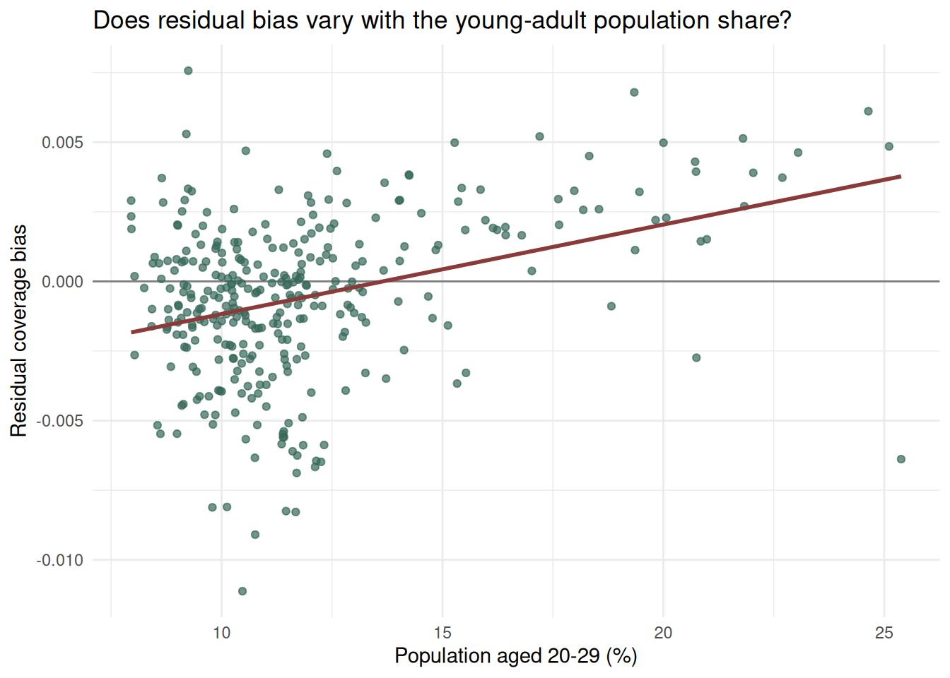
ggplot(bias_covariates, aes(x = per_level4, y = residual_bias)) +
  geom_hline(yintercept = 0, colour = "grey50") +
  geom_point(alpha = 0.7, colour = "#356859") +
  geom_smooth(method = "lm", se = FALSE, colour = "#8B3A3A") +
  labs(
    x = "Population with level 4 qualifications (%)",
    y = "Residual coverage bias",
    title = "Does residual bias vary with the share of highly educated individuals?"
  ) +
  theme_minimal()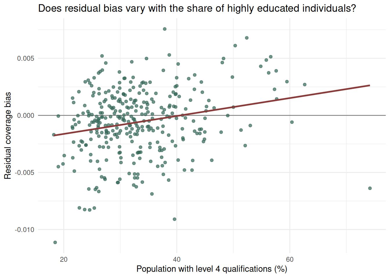
It is important to remember that these plots do not prove causality. However, they help us identify whether coverage bias displays any meaningful patterns rather than being randomly distributed across places.
Fit a simple explanatory model
We now fit a multi-variate linear regression. The outcome is residual_bias, which measures how much more or less coverage bias an LAD has compared with the proportional baseline.
The predictors in this regression represent broad demographic, socioeconomic, resource-access and geographic characteristics:
-
per_age_20.29: share of the population aged 20-29 -
per_age_70plus: share of the population aged 70 or over -
per_level4: share of the population with Level 4 qualifications -
per_hh_no_centralheat: share of households without central heating -
per_NS_SeC_L13_routine: share of the population in routine occupations -
rural_pct: rural population share
bias_model <- lm(
  residual_bias ~
    per_age_20.29 +
    per_age_70plus +
    per_level4 +
    per_hh_no_centralheat +
    per_NS_SeC_L13_routine +
    rural_pct,
  data = bias_covariates
)

summary(bias_model)
Call:
lm(formula = residual_bias ~ per_age_20.29 + per_age_70plus +
    per_level4 + per_hh_no_centralheat + per_NS_SeC_L13_routine +
    rural_pct, data = bias_covariates)

Residuals:
       Min         1Q     Median         3Q        Max
-0.0145064 -0.0013750  0.0002266  0.0014997  0.0079651

Coefficients:
                         Estimate Std. Error t value Pr(>|t|)
(Intercept)            -2.133e-02  2.558e-03  -8.339 2.17e-15 ***
per_age_20.29           2.300e-04  6.737e-05   3.415  0.00072 ***
per_age_70plus          2.155e-04  6.687e-05   3.222  0.00140 **
per_level4              2.347e-04  3.470e-05   6.764 6.30e-11 ***
per_hh_no_centralheat   6.681e-04  1.332e-04   5.015 8.77e-07 ***
per_NS_SeC_L13_routine  5.218e-04  7.486e-05   6.970 1.79e-11 ***
rural_pct              -7.687e-06  8.213e-06  -0.936  0.34999
---
Signif. codes:  0 '***' 0.001 '**' 0.01 '*' 0.05 '.' 0.1 ' ' 1

Residual standard error: 0.002441 on 324 degrees of freedom
Multiple R-squared:  0.3095,    Adjusted R-squared:  0.2968
F-statistic: 24.21 on 6 and 324 DF,  p-value: < 2.2e-16
For easier reading, we can extract the coefficient table.
coefficient_table <- as.data.frame(coef(summary(bias_model)))
coefficient_table$term <- rownames(coefficient_table)
rownames(coefficient_table) <- NULL
names(coefficient_table) <- c("estimate", "std_error", "statistic", "p_value", "term")

coefficient_table |>
  select(term, estimate, std_error, statistic, p_value)
term estimate std_error statistic p_value
1 (Intercept) -2.133358e-02 2.558308e-03 -8.3389386 2.173616e-15
2 per_age_20.29 2.300286e-04 6.736613e-05 3.4146024 7.199558e-04
3 per_age_70plus 2.154692e-04 6.687211e-05 3.2221083 1.401820e-03
4 per_level4 2.347167e-04 3.470325e-05 6.7635367 6.297559e-11
5 per_hh_no_centralheat 6.680707e-04 1.332254e-04 5.0145895 8.769749e-07
6 per_NS_SeC_L13_routine 5.217525e-04 7.486137e-05 6.9695826 1.786132e-11
7 rural_pct -7.687229e-06 8.213161e-06 -0.9359648 3.499884e-01The sign of each coefficient (estimate) gives the direction of the association, holding the other variables in the model constant. A positive coefficient means that higher values of the covariate are associated with more residual coverage bias (less representation than average in the mobile phone dataset). A negative coefficient means that higher values are associated with less residual coverage bias.
Compare observed and fitted residuals
The fitted values from the model summarise the part of residual bias that can be described by the selected covariates.
bias_covariates <- bias_covariates |>
  mutate(
    fitted_residual_bias = fitted(bias_model),
    unexplained_residual = residual_bias - fitted_residual_bias
  )

ggplot(bias_covariates, aes(x = fitted_residual_bias, y = residual_bias)) +
  geom_hline(yintercept = 0, colour = "grey80") +
  geom_vline(xintercept = 0, colour = "grey80") +
  geom_point(alpha = 0.7, colour = "#356859") +
  geom_smooth(method = "lm", se = FALSE, colour = "#8B3A3A") +
  labs(
    x = "Fitted residual bias",
    y = "Observed residual bias",
    title = "How much residual bias is described by the selected covariates?"
  ) +
  theme_minimal()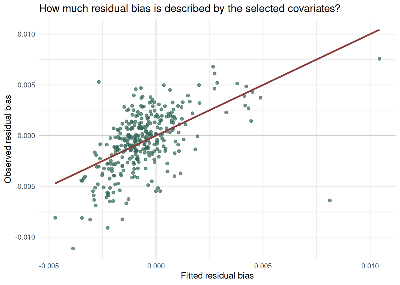
The largest unexplained residuals are areas where the simple model does not capture the local pattern well. These areas may be useful to inspect before choosing an adjustment strategy.
bias_covariates |>
  arrange(desc(abs(unexplained_residual))) |>
  select(
    area,
    name,
    residual_bias,
    fitted_residual_bias,
    unexplained_residual
  ) |>
  head(10)
area name residual_bias fitted_residual_bias
1 E09000001 City of London -0.006384105 8.122286e-03
2 E07000228 Mid Sussex 0.005293006 -2.672141e-03
3 E07000069 Castle Point -0.011125629 -3.874755e-03
4 E07000098 Hertsmere -0.009093393 -2.256289e-03
5 E07000113 Swale -0.008249398 -1.571936e-03
6 E07000030 Eden -0.005470657 1.957089e-04
7 E08000032 Bradford 0.004585010 -9.408765e-04
8 E07000167 Ryedale -0.005474680 -4.322945e-06
9 E07000135 Oadby and Wigston 0.004689751 -7.009294e-04
10 E06000034 Thurrock -0.006666153 -1.387337e-03
unexplained_residual
1 -0.014506392
2 0.007965147
3 -0.007250874
4 -0.006837104
5 -0.006677462
6 -0.005666366
7 0.005525887
8 -0.005470357
9 0.005390681
10 -0.005278816Interpretation
This vignette uses a simple regression to “explain” bias. If residual bias shows a non-trivial relationship with area-level characteristics, then the variation in bias across geographies is not simply random noise. Instead, this is a sign that some types of places are more or less visible in the digital trace data than expected under a constant-coverage baseline.
This will be important for bias adjustment. A single global correction assumes that all places are covered at roughly the same rate. If coverage bias varies with demographic, socioeconomic or geographic characteristics, then adjustment methods need to allow bias to vary across places too.
The regression used here is deliberately simple and descriptive. The associated research paper uses more flexible explainable machine-learning methods to capture nonlinear and interacting relationships. The purpose of this vignette is to introduce the same logic in a way that is easy to inspect, reproduce and adapt.