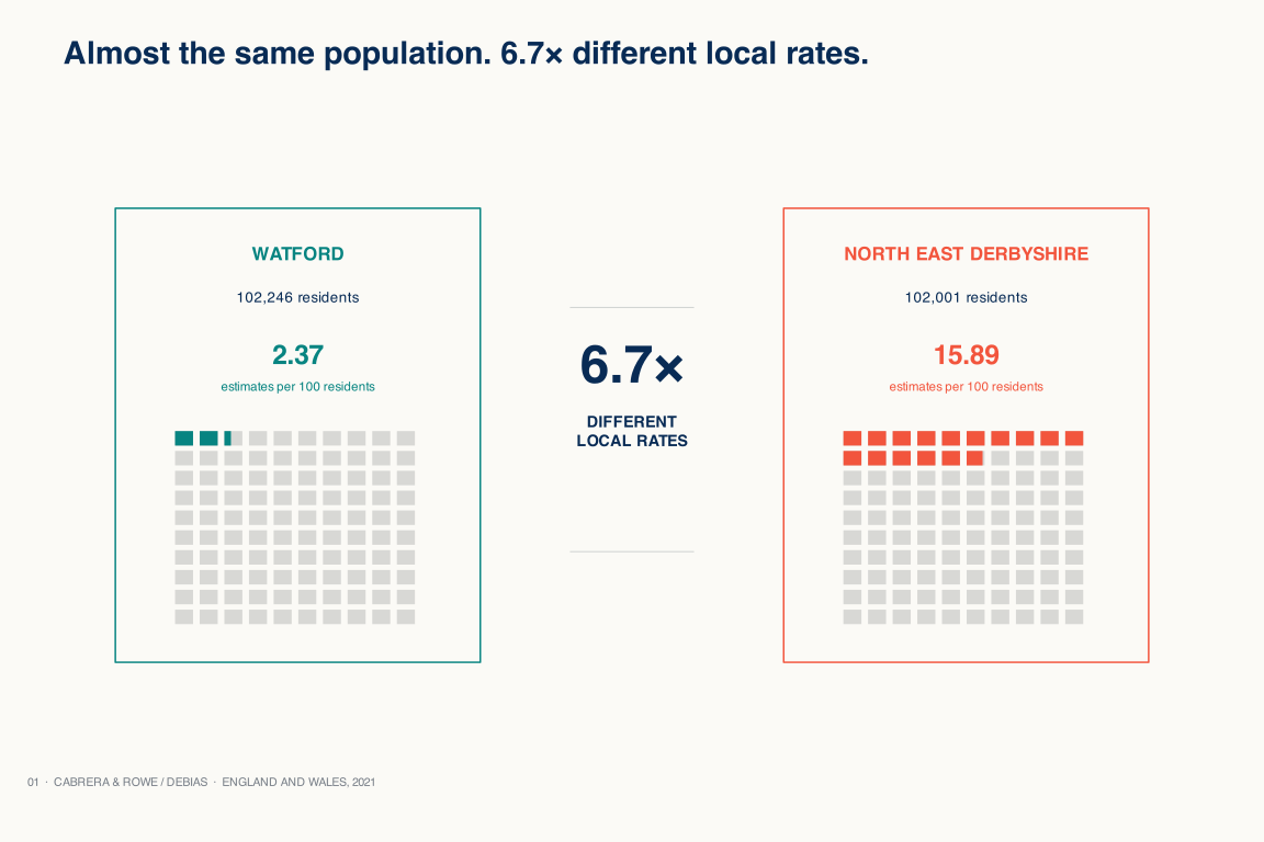
Watford
102,246 residents
Meta active-user estimate: 2,419
2.37 accounts per 100
DEBIAS data story · Published in Royal Society Open Science
Digital-trace counts provide a useful signal but they do not represent the local populations. Comparing active-user counts from Meta illustrates wide variation in coverage for places with similar population counts.
1 / 8 · Pair
Read from the start ↑102,246 residents
Meta active-user estimate: 2,419
2.37 accounts per 100
different local
population coverage rates
102,001 residents
Meta active-user estimate: 16,204
15.89 accounts per 100
1 / 8 · Pair
Places can have similar resident population counts but have widely different coverage levels in digital-trace data. Using data from Meta, we illustrate how population coverage varies across UK local authorities. Comparing Watford and North East Derbyshire illustrate how two places with similar resident population counts can have a 6.7 time difference in population coverage.
2 / 8 · Counts
Across local authorities, census populations and Meta’s active-user population estimates have a Pearson correlation of r = .91. More populated places generally have more accounts. Yet, this high correlation does not quantify limited coverage or representation.
Local variations in coverage rates reveal which populations are under- or over-represented in digital-trace data.

3 / 8 · Population coverage rates
Expressing Meta coverage as user accounts per 100 census residents, local variations become clearer. They vary widely around Meta’s fitted rate of 8.09 per 100 residents across local authorities.
The middle 90% of areas spans 4.61 to 12.31 accounts per 100 residents, equivalent to a 2.7x range. Such level of variation is typical in digital-trace data from various sources.

4 / 8 · Map
Mapping coverage rates relative to the fitted Meta rate reveals under- (darker teal colours) and over-represented (darker coral colours) places.
Coverage rates vary systematically but differently with demographic, socioeconomic, accessibility, mobility and geographical features of local areas. Analysing these relationships helps more precisely identify which population groups may be under- or overrepresented in digital-trace data.

Different data sources, different patterns
Meta is one data source and offers one representation of local populations. But there are more sources. Each may display a high correlation score but offers its own distorted representation of local populations. We investigate four sources.
Each data source has its own fitted coverage rate. Still, the same area can land on opposite sides of a fitted coverage rate depending on the digital-trace data source used to represent their local populations.
Twitter/X uses inferred monthly home locations of active accounts and Meta uses active-user population estimates for March 2021. Multi-app1 uses inferred home locations of qualifying devices from the first week of April; Multi-app2 uses inferred home locations from preprocessed multi-application GPS data for November. The fitted index normalises scale; it does not make the sources equivalent.
5 / 8 · Sources
Focusing on Watford and North East Derbyshire shows large differences in coverage by data source. For Watford, the fitted coverage rate is below for Meta, but above for Twitter/X, Multi-app1 and Multi-app2. For North East Derbyshire, it is above for Meta and Multi-app2, but below for Twitter/X and Multi-app1.
The places have not changed. The source has.
| Source | Watford | North East Derbyshire |
|---|---|---|
| Twitter/X | 1.09× 9% above | 0.49× 51% below |
| Meta | 0.29× 71% below | 1.96× 96% above |
| Multi-app1 | 1.44× 44% above | 0.83× 17% below |
| Multi-app2 | 1.27× 27% above | 1.21× 21% above |
300 of 331 local authority areas display higher or lower coverage rates than the fitted or expected rate in at least one data source. This indicates that patterns of under- or over-representation across areas are the norm, rather than an exception.
6 / 8 · Understand the influence of local attributes
Coverage rates vary systematically with local population attributes. By analysing this variation, we can identify which population groups are likely under- or over-represented in digital-trace data. We investigate differences across our four data sources: Twitter/X, Meta, Multi-App1 and Multi-App2.
We use a machine-learning based model (XGBoost) to analyse which place-based attributes are the most important predictors of low or high population coverage bias. These attributes identify the population groups which are under- or over-represented in a particular digital-trace dataset.
Selected source: Twitter/X
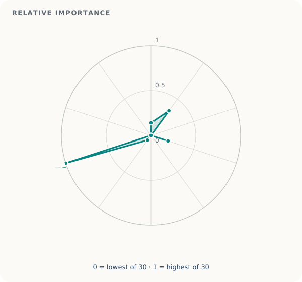
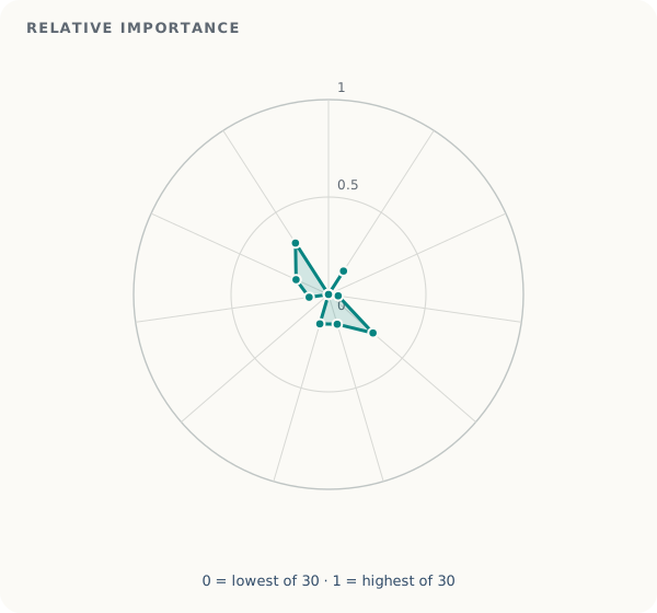
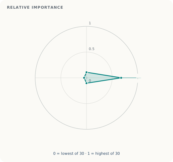
Choose a digital-trace data source. The radial plots below identify the most important place-based attributes associated with variability in population coverage rates. For example, the share of the population aged 20–29 and share of households without a car are the most important predictors of low population coverage rates.
We find that the associations between local attributes and population coverage rates can flatten, reverse direction or change shape across the range of observed records. Machine learning is employed to capture these non-linear relationships.
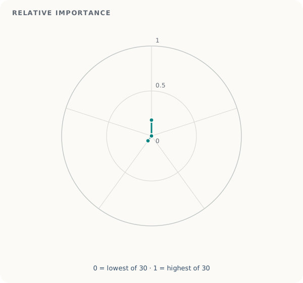
1 of 4 · Demographic context
Swipe horizontally to see raw values and ranks.
| Context | Area characteristic | Raw mean absolute SHAP | Relative importance (0–1) | Source rank |
|---|---|---|---|---|
| Demographic | Population aged 0–9 | 0.00002691794021183855 | 0.140856123551 | 12 |
| Demographic | Population aged 10–19 | 0.0000649645600550803 | 0.339946371288 | 3 |
| Demographic | Population aged 60–69 | 0 | 0 | 20 |
| Demographic | Households with six or more people | 0.00003805668792388726 | 0.199142931961 | 6 |
| Demographic | Female population | 0 | 0 | 20 |
| Demographic | Population aged 30–39 | 0 | 0 | 20 |
| Demographic | Population aged 50–59 | 0.000012332312306408194 | 0.064532489939 | 17 |
| Demographic | Population aged 20–29 | 0.00019110237832216587 | 1 | 1 |
| Demographic | Population aged 40–49 | 0 | 0 | 20 |
| Demographic | Population aged 70 and over | 0 | 0 | 20 |
| Socioeconomic | Routine occupations | 0 | 0 | 20 |
| Socioeconomic | Population with Level 4 qualifications or above | 0.000027273989262934978 | 0.142719256047 | 11 |
| Socioeconomic | Population with no qualifications | 0 | 0 | 20 |
| Socioeconomic | Never worked and long-term unemployed | 0.000009591420828893087 | 0.050189960549 | 18 |
| Socioeconomic | Small employers and own-account workers | 0.00005770954486924102 | 0.301982347765 | 5 |
| Socioeconomic | Full-time students | 0.000030419167037705294 | 0.159177333662 | 9 |
| Socioeconomic | Lower supervisory and technical occupations | 0.00003005039306236026 | 0.157247614217 | 10 |
| Socioeconomic | Semi-routine occupations | 0 | 0 | 20 |
| Socioeconomic | Intermediate occupations | 0.000019170659907499414 | 0.100316176469 | 15 |
| Socioeconomic | Higher managerial, administrative and professional occupations | 0.000034953457907249684 | 0.18290435846 | 7 |
| Socioeconomic | Lower managerial, administrative and professional occupations | 0.000059920262322560554 | 0.313550583978 | 4 |
| Resource accessibility | Households without central heating | 0.000020664578218914 | 0.108133548103 | 13 |
| Resource accessibility | Households without a car or van | 0.00012899871064449975 | 0.675024098481 | 2 |
| Resource accessibility | Households owned | 0.000019936567481754933 | 0.104324015519 | 14 |
| Resource accessibility | Households not deprived in any dimension | 0.000008992498082396038 | 0.047055919248 | 19 |
| Mobility & geography | Population density | 0.00003367524472512583 | 0.176215728034 | 8 |
| Mobility & geography | Rural population | 0 | 0 | 20 |
| Mobility & geography | Population born outside the UK | 0 | 0 | 20 |
| Mobility & geography | Employed residents working mainly at or from home | 0.000012688271766345006 | 0.066395153623 | 16 |
| Mobility & geography | Population resident in the UK for less than two years | 0 | 0 | 20 |
The illustrative examples below show the shape of the relationship between key place-based attributes and population coverage rates for different data sources. Radial plots indicate which place-based attributes are important predictors of low coverage rates, but they do not tell us how these attributes influence coverage. For example, the radial plots show that the percentage of people aged 20–29 is an important predictor of low coverage rates in Twitter/X. The middle plot below shows how this relationship unfolds: as the percentage of people aged 20–29 increases, population coverage in Twitter/X data also tends to increase; that is, poor coverage becomes smaller. Here, the y-axis represents the inverse of population coverage rates.
We find that the associations between local attributes and population coverage rates can flatten, reverse direction or change shape across the range of observed records. Machine learning is employed to capture these non-linear relationships.
MetaPopulation density

Twitter/XArea share aged 20–29

Multi-app1Area share with Level 4 qualifications

7 / 8 · Conclusions
Across four digital-trace data sources, we find substantial local differences in population coverage. These differences vary across places and data sources, and they are associated with demographic, socioeconomic, resource accessibility, mobility and geographical attributes of local populations. These variations reflect biases resulting from the under- and over-representation of certain population groups in the digital platforms used to collect the data. Assessing the representation of digital-trace data is therefore required to define appropriate ways of adjusting them and using them for reliable population inference.
Assess before you infer.
Read the methods, limitations and wider findings8 / 8 · Learn more
Explore
See its observed Meta rate, its distance from the fitted benchmark and a precise interpretation note.
Find a local authorityAbout the research
Carmen Cabrera and Francisco Rowe of the University of Liverpool’s Geographic Data Science Lab compared four digital-trace datasets with the 2021 Census across 331 local authority areas in England and Wales. Their article published in Royal Society Open Science, Making hidden biases visible in population location data from mobile phones, examines how population coverage varies and which area-level characteristics are associated with that variation.
The analysis focuses on assessing area-level patterns while protecting the anonymity of individual users of digital technologies.
Read the methods, limitations and wider findingsStudy at a glance
Article attention
The Altmetric badge summarises online attention to the article, including mentions in news outlets, blogs and social media.
Read the published article